1. Introduction
The topic of demographic mortality is very important for several social and scientific aspects. Over the decades, the statistical sciences associated with demographic aspects have shown increasing interests in mortality statistics as age increases. Researchers - working on interdisciplinary aspects of the mortality problem - have tried to identify theoretical models that can predict trends in demographic mortality statistics as people age. These models can be divided into two different classes: those based on empirical rules of prediction and those based on models of processes underlying fatal events. In the first group we can consider the Gompertz-Markeham and Lee-Carter models,
| [1] | B. Gompertz, On the Nature of the Function Expressive of the Law of Human Mortality, and on a New Mode of Determining the Value of Life Contingencies, in Philosophical Transactions of the Royal Society of London, vol. 115, 1825, pp. 513-585. |
| [2] | W. M. Makeham, On the Law of Mortality and the Construction of Annuity Tables, in J. Inst. Actuaries and Assur. Mag., vol. 8, 1860, pp. 301-310. |
| [3] | Lee, Ronald D.; Carter, Lawrence R. (September 1992). "Modeling and Forecasting U.S. Mortality". Journal of the American Statistical Association. 87(419): 659-671.
https://doi.org/10.2307/2290201 |
[1-3]
while in the second group we can include theories related to various different disciplines like entropic models or models related to information theory or to reliability theory
| [4] | D. Makowiec, D. Stauffer and M. Zieliński, “Gompertz law in simple computer model of ageing of biological population”, http://arxiv.org/abs/cond-mat/0107107v1 |
| [5] | A. Racco, M. Argollo de Menezes and T. J. Penna “Search for an unitary mortality law through a theoretical model for biological ageing”, http://arxiv.org/abs/adap-org/9709002v1 |
| [6] | M. D. Pascariu, A. Lenart & V. Canudas-Romo (2019) “The maximum entropy mortality model: forecasting mortality using statistical moments”, Scandinavian Actuarial Journal, 2019: 8, 661-685, https://doi.org/10.1080/03461238.2019.1596974 |
| [7] | A. Boulougari, K. Lundengård, M. Rančić, S.Silvestrov, S. Suleiman & B. Strass (2019) “Application of a power-exponential function-based model to mortality rates forecasting”, Communications in Statistics: Case Studies, Data Analysis and Applications, 5: 1, 3-10,
https://doi.org/10.1080/23737484.2019.1578705 |
| [8] | S. J. Clark “A General Age-Specific Mortality Model With an Example Indexed by Child Mortality or Both Child and Adult Mortality”, Demography. 2019 June; 56(3): 1131-1159.
https://doi.org/10.1007/s13524-019-00785-3 |
| [9] | L. A. Gavrilov and N. S. Gavrilova, "The Reliability Theory of Aging and Longevity" J. theor. Biol. (2001) 213, 527-545. |
| [10] | P. Y. Nielsen, M. K Jensen, N. Mitarai, S. Bhatt “The Gompertz Law emerges naturally from the inter dependencies between sub components in complex organisms”
https://doi.org/10.1038/s41598-024-51669-5 |
[4-10]
. Many demographic studies have proposed evolutionary models of mortality and, in particular, the literature on mortality trends at older ages is extensive. It is not the purpose of this article to review these studies and models, but we can here emphasize one general feature: in all studies - to the author’s knowledge - the age distribution of mortality is described through the use of two or more parameters, the values of which must be adjusted to fit the actual population curves and/or their time series (see e.g. the algorithm list table in Ref.
| [7] | A. Boulougari, K. Lundengård, M. Rančić, S.Silvestrov, S. Suleiman & B. Strass (2019) “Application of a power-exponential function-based model to mortality rates forecasting”, Communications in Statistics: Case Studies, Data Analysis and Applications, 5: 1, 3-10,
https://doi.org/10.1080/23737484.2019.1578705 |
[7]
). In the paper in Ref.
, the author presented a conjecture on mortality at high ages in which the demographic mortality vs age is predicted to tend toward a theoretical function of age as lifespan increases. This theoretical function, called mTC(a, TC), is defined by an age variable ‘a’ and a single parameter TC (which is proportional to the area under the curve when 0 <a <∞ and refers thus to “Total Cases”). This function has been analytically described and characterized in the work of Ref.
. The theoretical basis for the derivation of this function had been laid in Ref.
| [12] | G. Alberti “Fermi statistics method applied to model macroscopic demographic data”.
https://doi.org/10.48550/arXiv.2205.12989 |
[12]
paper in which the Fermi statistic method was used to generate the function. The characteristic feature of our model compared to other models is that it is able to approximate the mortality curve trend with only one parameter (TC). At the variation of TC, the curve expands (or contracts) along the time (age) axis together with a peak of maximum mortality. The position and shape of this peak depend then only on the value of TC. Another feature of the model, first introduced in Ref.
| [12] | G. Alberti “Fermi statistics method applied to model macroscopic demographic data”.
https://doi.org/10.48550/arXiv.2205.12989 |
[12]
, is that it is not empirically derived but comes from the study of a cellular automaton - called Arbitrary Oscillator (ArbO) - which encounters
stochastic ‘end-of-life’ events in the course of its evolution. The evolution of ArbO is described by a system of diophantine equations (see also Ref.
| [13] | S-Q-U Systems Web Site, Available from:
HYPERLINK " https://squ-systems.eu/" https://squ-systems.eu/ [Accessed 13 November 2025] |
[13]
for more information). The author’s hypothesis is that one of the solutions of this equations system can be related to real mortality curves and in particular the so called ‘most probable’ solution. If, therefore, real demographic mortality curves can be correlated and modelled by this theoretical function, then the same characteristic limitations of the theoretical function will have to apply to these same real curves - asymptotically- over long time periods. In particular, the existing height and width limitation of the theoretical curve will also have to be observed in the real cases. In the following Section 2, the mathematical formulations of these limits will be presented. In the next Section 3 some tests on the matter using the demographic Life Tables data are carried out and finally some conclusive considerations are given.
2. Materials and Methods
Going back to the formulations of Ref.
, let us consider the following equation that provides the mTC function, where the symbol ln indicates the natural logarithm:
mTC(a, TC)(1)
where n, m, p are pure numbers:
In our hypothesis, mTC represents the theoretical mortality distribution vs. a sliding age interval of five years based at position ‘a’ with a given TC parameter. This continuous function is equivalent to the discrete dx figure directly given in the Life Tables with five years age intervals and should not be confused with Life Table indirectly derived quantities such as mortality rate or mortality force. An example of this function curve can be graphed as follows in
Figure 1 for the e.g. case where TC = 100000 and ‘a’ is measured in year unit. The graphs also show the particular ‘a’ value (apeak) that leads to the curve maximum (in this case apeak ~88 years). In the following we will call this apeak value for brevity as ‘ap’. One can also see a slight asymmetry to the left of the curve peak, which is more evident in the logarithmic scale graph. This function possesses the following two remarkable properties, which come from the system of diophantine equations mentioned in Section 1:
(2)
Therefore, according to the first integral of (
2), the area under the mTC curve depends only on the parameter TC to which is proportional. If we now divide the function mTC(a,TC) by TC, we will obtain a function which we will call mTCn meaning the ‘normalized’ function of mTC. This function will have a constant ‘normalized’ area under the curve and is defined by the following equation:
mTCn(a,TC)=(mTC(a,TC))/TC(3)
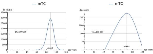
Figure 1. Linear and Log. plots of the mTC(a, TC) as function of ‘a’ with TC=100000.
TC is also decisive for finding the age ‘ap’ corresponding to the maximum peak of the curve and it can be shown via calculus that the following relationships holds true:
ap;(4)
If we now substitute TC in (
3) using the second expression in (
4), we obtain via algebraic transformations a normalized mTC-type function depending by a single parameter ‘ap’, like:
(5)
We have thus obtained, with (
5), an expression of the theoretical normalized mortality curve of constant area vs the age variable and the ‘ap’ parameter. The (
5) can then be used to mimic curves similar to the real ones present in standard Life Tables, which have by convention a deaths cases volume of 100000 cases. To obtain the comparison, it will suffice to multiply the (5) by the number 100000. This scale change is carried out in the following figure, which illustrates the different theoretical mortality curves for ten ‘ap’ values -15 years apart from each other- and with an area (i.e. number of cases) proportional to 100,000. It appears from the graphic analysis of
Figure 2 that - after an initial rapid growth - the height of the peaks remains constant despite the increase in peak age (see also
Table 1 in the following for numerical data). Another remarkable feature is that the apparent shape of the curves does not vary significantly and therefore their width at mid-height appears constant. The only effect of the increase in peak age (and TC) is to shift the curve itself to the right on the age axis.
These considerations can be justified more formally as follows.
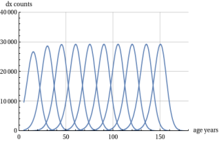
Figure 2. Deaths (dx) as per mTCnp for 100000 cases and ‘ap’ values 15 years apart.
2.1. The Height Limit of the Theoretical Mortality Curve
Considering relation (
5) above, we see that the point of maximum height of the generic curve will be given by mTCnp(ap, ap). It will then be possible to study its value as ap tends to infinity. It turns out from the calculations that:
(6)
where the second member of (
6) is a number, whose value is 0.292541, which then, in the conventional case of the Life Tables of 100000 deaths, leads to a peak limit value of 29254 cases for age intervals of five years. This limit is asymptotic for mTCnp(ap, ap) although for practical purposes it is actually reached -in the theoretical curve case- by the age of about 60 years.
2.2. The Full Width at Half Maximum Limit of the Theoretical Mortality Curve
If, as conjectured by Ref.
, the mortality curves are to hold up to a theoretical mTC curve as lifespan (and consequently our ‘ap’) increases, then it will also be interesting to assess the ‘shape’ of these curves to see whether they approximate the theoretical shape of the mTC. This evaluation will have to be done on a measurable basis and to this end we resort to the curve FWHM (full width at half maximum). To measure this theoretical reference FWHM, the following equation must be solved in the unknown ‘a’ variable:
(7)
In our case, the solutions can be expected to be two values, a1 and a2, with a1 < ap < a2 and the sought-after value of FWHM will be equal to:
Unfortunately, equation (
7) is transcendent in nature and therefore very difficult to solve analytically. With numerical techniques, however, it is possible to provide quite significant results as shown in
Table 1 below. It can be seen from Table that the FWHM appears invariant over the entire range of ‘ap’ values and that therefore the reference value for the FWHM to be set for the actual curves is approx. 15.6 years (for sampling intervals of five years). The second column shows the max. height of the mTCnp and the asymptotic convergence to the max. value above defined. These values are consistent with the behaviour of the curves cluster seen in
Figure 2.
Table 1. Reference limit for FWHM computation.
Age peak year | 10^5 * mTCnp(ap,ap) | a1 [y] | a2 [y] | FWHM [y] |
15 | 26718.1 | 6.85785 | 22.4807 | 15.6228 |
30 | 28675.4 | 21.8579 | 37.4807 | 15.6228 |
45 | 29175.8 | 36.8579 | 52.4807 | 15.6228 |
60 | 29244.2 | 51.8579 | 67.4807 | 15.6228 |
75 | 29252.9 | 66.8579 | 82.4807 | 15.6228 |
90 | 29253.9 | 81.8579 | 97.4807 | 15.6228 |
105 | 29254.1 | 96.8579 | 112.481 | 15.6228 |
120 | 29254.1 | 111.858 | 127.481 | 15.6228 |
135 | 29254.1 | 126.858 | 142.481 | 15.6228 |
3. Results: The Test with the Real Mortality Life Tables
To test the above-mentioned boundary limits against actual demographic mortality data, we used three case studies. They refer to mortality data from three countries: the United States of America, Japan and Italy. The three countries differ in geographical location, population size and lifestyle. In the selection of these data, the distinction by sex of the population has been maintained. The demographic data were processed for the USA from the Life Tables available in Ref.
| [14] | L. A. Gavrilov and N. S. Gavrilova, "Mortality Measurement at Advanced Ages: a Study of the Social Security Administration Death Master File”, North American Actuarial Journal. 15(3): 432-447. https://doi.org/10.1080/10920277.2011.10597629 |
[14]
and
| [15] | Elizabeth Arias and Jiaquan Xu, “United States Life Tables, 2017", NVSS, Volume 68, Number 7, June 24, 2019. |
[15]
, for Japan from Ref.
| [16] | National Institute of Population and Social Security, “The Japanese Mortality Database”, Available from:
HYPERLINK "https://www.ipss.go.jp/p-toukei/JMD/index-en.asp" https://www.ipss.go.jp/p-toukei/JMD/index-en.asp [Accessed 13 November 2025] |
[16]
and in the case of Italy from Ref.
. In all cases, mortality tables structured 5 x 1, i.e. with age intervals of 5 years referring to survey periods of one year, were considered. The period interval chosen was approximately 45 years, i.e. 1970 to 2017 for the USA and 1974 to 2019 for Japan and Italy. Thus, starting from the above-mentioned Life Tables, an additional database of correlated data was generated, including: country, sample year, maximum height of the mortality peak, FWHM of the mortality peak, age corresponding to the apex of the mortality curve, percentage share of coverage of the theoretical mTC model, all separate for the two sexes. To clarify this approach, consider the examples in
Figure 3 below. The actual mortality data can be arranged on a graph with a horizontal axis corresponding to the five-year age intervals cases and with the vertical axis showing the number of deaths (dx) in these intervals. In
Figure 3 we represent e.g. a case of a mortality table for one country and one year period. It can be seen from the figure that the discrete data in the Life Tables for the chosen period (
Figure 3(a)), are interpolated by a continuous line (
Figure 3(b)). This will make it possible to calculate an equivalent maximum height and consequently determine a half-height width (FWHM) defined by the intersection segment of the interpolated curve and a horizontal half-height line. The availability of the interpolated continuous curve also makes it possible to identify the age position of the peak maximum (vertical line in
Figure 3(c)) and thus also to draw a theoretical mTC curve having the same vertex . With the theoretical curve plotted in this way, it will also be possible to calculate a 'quality factor' of the mTC model as an area coverage ratio with respect to the total area of the interpolated curve, which conventionally corresponds to about 100000 cases. This factor figure is also printed in the (c) section of the figure. The numerical calculations and graphical projections were processed with the aid of a mathematical application on a computer. This tool is well known and used in science. For interested readers, the author can make the software routines used and the calculated database available. With the approach thus described, we can see below some results of the analysis of real data.
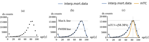
Figure 3. Mortality data (dots in (a)) are interpolated with continuous curve (b) and over-imposed on an apex compliant mTC curve (c).
3.1. The Change in the Shape of Mortality Curves
Figures 4, 5, 6, 7, 8, 9 show us the variation in the shape of the real mortality curves in the two extreme sampling periods and for the countries considered. In all cases, the graphs also show the limit line of maximum height for the curve defined in Section 2. Although graphs are available for all sexes, we have chosen to show hereunder the case of females, which always have a narrower FWHM than males and therefore lend themselves more to the verification of height and FWHM limits. From the figures one can see how - in the two time periods considered - in all cases there is a narrowing of the shape of the mortality peak and an approximation to the shape of the correlated theoretical peak. One also notices a more rapid coincidence between the theoretical curve and the real curve on the peak right-hand side, while on the peak left-hand side there is a greater, though diminishing, difference. This shrinkage characteristic is measured by the 'mTC Area %' figure. This effect has already been studied in Ref.
as part of the construction of the conjecture discussed here. The peak mortality heights and relative FWHM in the intermediate periods for the three countries and for the two different sexes were then studied in detail and the issues shown in the following.
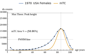
Figure 4. USA female curve for 1970 year with absolute limit line for max. heigh.
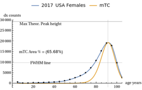
Figure 5. USA female curve for 2017 year with absolute limit line for max. heigh.
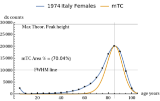
Figure 6. Italy female curve for 1974 year with absolute limit line for max. heigh.
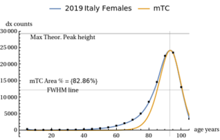
Figure 7. Italy female curves for 2019 year with absolute limit line for max. heigh.
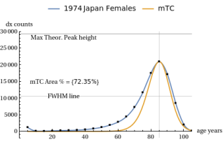
Figure 8. Japan female curve for 1974 year with absolute limit line for max. height.
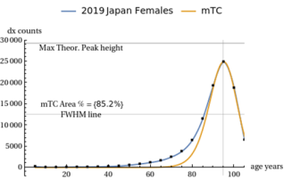
Figure 9. Japan female curve for 2019 year with absolute limit line for max. height.
3.2. The Maximum Peaks Height Increases with the Sampling Period Year
Figure 10 collects the results for the peak height data analysis. It can be seen that the height of the interpolated curves increases and approaches the theoretical limit as a general trend for all the cases. This trend is compatible with the rise in the mortality peak age (the 'ap' magnitude) along the time periods. The Life Tables for all the three countries show a general life span rise present in the period range considered by our analysis. Both these trends of the peak height rise and lifespan rise are then in accordance with our mortality conjecture.
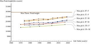
Figure 10. Development of mortality peak height as a function of survey Life Tables years and countries/sexes.
3.3. The Peak FWHM Decreases with the Sampling Period Year
Similarly, the FWHM of peak mortality in the various real cases shows a decreasing trend over the sampling period. This decrease approaches the theoretical FWHM limit without exceeding it, as shown in
Figure 11.
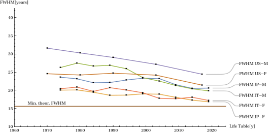
Figure 11. Development mortality peak FWHM as a function of survey Life Tables years and countries/sexes.
3.4. The Search for Peaks Height and FWHM in a Regional Case
It is now reasonable to assume that the larger the sample of data taken into account, the greater the statistical dispersion of the data can be. One might think to find counterexamples to our theory of absolute limits of mortality curves by analyzing data on a reduced sample like in regional basis. This is considering that local regional data collect more internally homogeneous demographic data. Therefore, the same assessments as above were made for the specific case of regional data for a single period. This was the case of Italy where we studied the distribution of mortality data over 18 regions for the survey year 2019. The
Figures 12 and 13 shows the results obtained. In the two figures, the dashed line gives the limit value for the country total 2019. We see from the two figures above that there are regional cases where there is a greater closeness (or departure) from the theoretical limits. In particular, for females in the Trentino and Marche regions, the greatest closeness to the theoretical limits is noted. For this Marche region case we show in
Figure 14 the mortality curve graph where max. height is 25640 dx (against the limit of 29254) and FWHM comes to 16.1 years (against the limit of 15.6 years) while the 'coverage' of the cases by the theoretical mTC is about 88%. Very similar data hold for Trentino region.
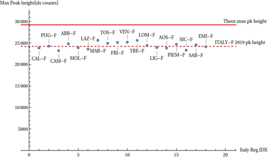
Figure 12. Distribution of peak mortality height data for 18 Italian regions in the case of females.
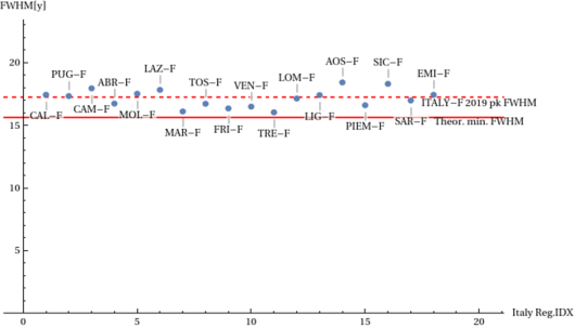
Figure 13. Distribution of peak mortality FWHM data for 18 Italian regions in the case of females.
4. Summary and Conclusions
In Section 2 we derived from the analytical expressions of the theoretical mortality curve two absolute limits for its trend. We posed the question whether these theoretical limits are respected in real cases from demographic mortality Life Tables curves. In order to test our hypotheses, we measured for three countries and for an overall 45 years interval, the height and width at mid-height (FWHM) data of the curves in question by interpolating the discrete death data from the 5x1 mortality Life Tables. This, distinguishing between the data of the two sexes. The results show that, as the life span increases (i.e. when the peak age increases), the maximum height and FWHM data converge towards the two respective limit levels. Values even closer to the theoretical limits are reached in two regional cases examined for Italy on 2019 data. These findings are also compatible with the author's conjecture about the tendency of mortality curves to converge towards mTC-type curves as the life span increases. Put another way, as social and health living conditions lead to a reduction in infant mortality and also to a reduction in middle-age mortality cases, then mortality curves tend to narrow and approximate the theoretical mTC curves. Our theory, however, predicts that these mortality curves, in advanced societies, may not shrink indefinitely but will have a limited shape in maximum height and minimum width.
In conclusion, what is presented in this paper -i.e. the possible presence of absolute limits in the mortality curves- may motivate further research and possible refinements of the ArbO theoretical model that -in particular- may lead to an understanding of the nature and explanation of the quantitative evolution of the asymmetric component on the left of the peak of the real mortality curves. The identified height limit also gives us a quick test for the validity of the present theory vs the future Life Tables with 5-year age intervals: the dx data for them, in the maximum mortality interval, must not exceed 29.3% of the total cases.
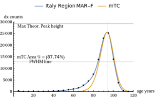
Figure 14. Italy females mortality curves for year 2019 in the region Marche.