In a previous preprint article, the author presented a conjecture on the trend of demographic mortality as the life span progresses. That article also provided a mathematical formulation of the statistical distribution to which mortality would tend in this case. In the present work, we show the possibility that the demographic mortality at high ages would be given by the sum of four main components. The four components were derived by iteratively solving the Fredholm equation that can be associated with the model. These solutions are presented for three demographic cases based on statistical data available in the public databases and literature. These are: mortality data in the US from 1970 to 2017, in Italy from 1974 to 2019 and in Japan from 1974 to 2019. In all cases, similarities and invariant components are noted and presented in graphs and numerical data. The four aforementioned components appear on average equally spaced in the age peaks (in the case of females ~50, ~63, ~77, ~90 ages) and are always present for all sample years and in all three countries. These same components can be used to reconstruct the qx datum, at advanced ages, of the considered Life Tables. A correlation with a more recent study using a multi-omics approach is pointed out.
This is an Open Access article, distributed under the terms of the Creative Commons Attribution 4.0 International License (http://creativecommons.org/licenses/by/4.0/), which permits unrestricted use, distribution and reproduction in any medium or format, provided the original work is properly cited.
Demographic Mortality, S-System Distribution, Demographic Life Tables, Fredholm Equation
1. Introduction
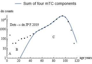
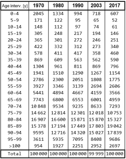
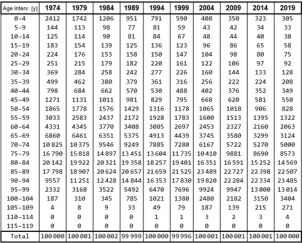
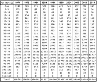
In the study of demography in various countries around the world, an important role is played by Life Tables in which, among other aspects of people's life data, mortality data (i.e. the deaths of people according to various age and population groups) are also presented. An example of these mortality data is given in the Appendix I where deaths by age group of five years and survey year are given for three countries in the case of the females. Analysis of the data reveals some common and recurring features. Firstly, the sum of all data in the columns is centered on 100000. This is due to the convention with which the data are normally presented in Life Tables. Furthermore, if we look at the vertical sequences of the data, we see that at the beginning of the columns the infant mortality figure appears to be present in the initial 0-4 age group. Thereafter, with increasing ages, the number of deaths appears almost independent of age up to the average of 40 years. After the age of 40-50, mortality starts to increase more sharply and reaches a statistical peak after which it decreases to zero at the age of the life limit. For brevity and in the following, we call area 'A' the area of infant mortality, 'B' the area of nearly flat mortality and 'C' the area of 'peak' mortality. In the paper in Ref.
[1]
G. Alberti “Aconjectureondemographicmortalityathighages.”
, the author presented a conjecture on mortality at high ages in which the mortality of zone C is predicted to tend toward a theoretical curve as lifespan increases. This theoretical function, called mTC(a, TC), is defined by an age variable ‘a’ and a single parameter TC (which coincides with the area under the curve plotted when 0 <a <Infinity) and has been analytically described and characterized in the works of Ref.
[1]
G. Alberti “Aconjectureondemographicmortalityathighages.”
paper in which the Fermi statistic method was used to generate the function. In Appendix II the aforementioned function is recalled in various analytical versions and useful formulas. To clarify how these relationships can be used in the case of real mortality data, consider the examples in Figure 1 and Figure 2 below:
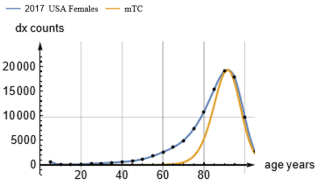
Figure 2. USA 2017 curve superimposed on the theoretical mTC curve.
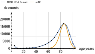
Figure 1 shows the mortality data (dots as per Figure A1 in Appendix I) for the USA 1970 interpolated with a continuous curve. Below this curve a second curve mTC is presented whose peak coincides with the interpolated mortality peak. This last curve is a mTC function curve with ap = 85.5761 years (where ‘ap’ is the age corresponding at the peak), TC = 70986 and a peak height equal to 16932. The overlap of the curves in the peak is obtained, using the formulas in Appendix I, by: 1) finding the age of the maximum of the interpolated curve and choosing this as ‘ap’ value, 2) calculating the TC parameter corresponding to the mTC with the same ‘ap’ and appropriately scaling the mTC curve by multiplying the mTC(a, 70986) function by a computed constant factor. Looking at Figure 1, you can see two distinct areas to the left and right of the peak not covered by the mTC curve. The area under the mTC curve indeed turns out to be 57881 dx cases, which means that the theoretical curve only partially covers the total cases of 100000 deaths and this is evident in the graphics of Figure 1. For Figure 2 (2017 data with the same graphics meaning of Figure 1), it can be seen that the peak of maximum mortality has shifted to a higher age (about 91.5 years) and that the area of difference between the two curves to the left of the mTC still persists, even if the interpolated curve shape shrinks, while the area of difference to the right minimizes. Areas A and B have also shrunk. Mortality coverage by the 2017 mTC curve is increased to 65940 dx over 100000 dx and the peak height becomes 19290 and the full width at half maximum (FWHM) is reduced, as can be seen by the interception of the FWHM horizontal line on the curve. This trend is consistent with the conjecture mentioned above. This conjecture predicts indeed that as the ‘ap’ increases, the two difference areas shrink until they disappear for very high ‘ap’ values. The calculations indicated above are carried out using the formulas in the Appendix II while the continuous interpolating function is generated through a well-known and widely used mathematical computer application. The present study aims to analyze in detail the possible components that give rise to the difference area to the left of the theoretical mTC curve. The study also wants to assess whether there are differences between these possible components when dealing with surveys in different countries. For these purposes, mortality data from the USA, Italy and Japan in the years 1970-2017 (USA) and 1974-2019 (Italy and Japan) will be considered. In order to search for 'hidden' components of the left-hand skewness of the mortality curve, the next section presents a Fredholm integral equation that in general can answer the problem posed. In the third section, an iterative solution based on graphical methods for this equation is proposed. In the following sections, the results obtained are presented and discussed with preliminary conclusions.
2. The Fredholm Equation
In the work of Ref.
[1]
G. Alberti “Aconjectureondemographicmortalityathighages.”
, it was seen how the area to the left of the mTC curve takes on the appearance of a second similar peak when graphed in isolation. This fact, together with the presence of the main peak, may lead us to hypothesize that the demographic experimental curve -in the high ages C zone sector- may be obtained from the multiple composition of theoretical mTC curves with different parameters and sizes. This can be expressed in general by the Fredholm integral equation of the first kind as follows:
(1)
In eq. (1), the term mdx represents the interpolated demographic data that is a function of the age and year t0 in which the demographic estimate is made (e.g. t0=1970 or 2017 in the cases depicted above in Figures 1 and 2). The mTC function is the one discussed above and detailed in Appendix II while the function f(t0,TC) identifies the 'weight' of the specific mTC function at the polling time t0 and with parameter TC. The integral in eq. (1) then gives us for each age ‘a’ and demographic sampling t0 the sum of the various mTC components that contribute to construct the mdx(a,t0) when weighted by the function f(t0,TC). Our problem is therefore to find the solution of the integral in eq. (1) in terms of the unknown function f, the mTC functions being known analytically and the mdx function numerically. In the case where the mTC components are present in discrete numbers of TC parameters and not continuous, eq. (1) becomes:
(2)
where n represents the number of possible discrete TC components and similarly the i-th f(t0) refers to the weight of the i-th mTC. Recalling the formulas in the Appendix II, it will also be possible to express eq. (2) using the normalized function mTCnp which depends on the usual variable ‘a’ and a parameter ‘ap’ equal to the age of the curve peak. Consequently, a weight i-th w(t0) will appear in the equation to represent exactly the number of dx cases relevant to the single component mTCnp(a,ap) with i-th parameter ap. Under these conditions, eq. (3) can be defined:
(3)
To the author's knowledge, no general solution of the Fredholm integral equation of the first type is known. Numerical solution methods do exist in the literature, but these can lead to oscillating terms and non-unique solutions (see e.g. Ref.
[3]
S. Twomey “OnthenumericalsolutionofFredholmintegralequationsofthefirstkindbytheinversionofthelinearsystemproducedbyquadrature.” J. ACM 10 (1963), 79-101.
[3]
and
[4]
Fredholm Integral Equations, web site: Available from:
). A possible practical approach is therefore to be guided by the specific physical problem and to bind the method of solution to it.
3. The Solutions of the Fredholm Integral Equation
To find a possible solution to eq. (3) in real cases, we used mortality data from three different countries: USA, Italy and Japan. It should be noted that these three countries are not only characterized by different lifestyles and social realities, but also have different population sizes (USA about 333 million people, Japan about 125 million and Italy about 60 million). Among these data we have chosen -for all three countries- the subset of the female case, which presents a lower dispersion (FWHM) of the mortality peak than the totals. The data used are available in Appendix I. In Ref.
[1]
G. Alberti “Aconjectureondemographicmortalityathighages.”
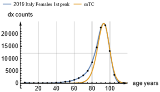
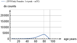
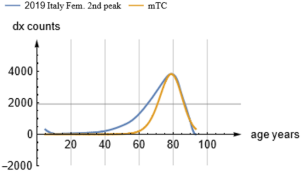
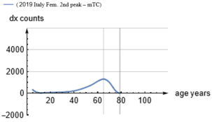
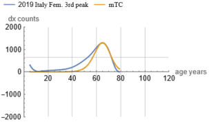
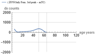
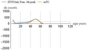
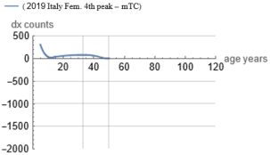
a graphical-analytical method was used to identify a second peak component to the left of the main peak. This method is extended here recursively. In practice, a third peak is identified from the second peak and so on by iteration. This procedure is based on the assumption that the peak of the actual curve can be approximated to a large extent by a single mTC function, which leaves a small portion of the curve not covered by the mTC to the left. The numerical and graphical calculations are done with the aid of a mathematical application and ad-hoc written software that runs with the mathematical application itself. The Appendix II equations are used for the computations. To clarify this method, the following Figures 3 and 4 (relevant e.g. to the Italy case) are useful. The dotted curve represents actual demographic data appropriately interpolated with a continuous curve (*). The mTC curve is our mTC function scaled to match the current peak. The Figure 4 show a "difference curve" obtained by subtracting the scaled mTC from the current curve. Note that in this figure two vertical lines show the location of the current peak and also the location of the previous figure peak. Similar operations are then applied in sequence to this 'difference' curve generating Figures 5, 6, 7, 8, 9, 10. It must be noted that in the Figure 4, we only consider the difference to the left of the subtraction of the curves, as the right-hand lobe tends - in general - to shrink faster than the left-hand one. This right-hand lobe is therefore omitted in the figures and in the calculations.
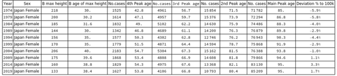
Figure 13. Japan female mortality components summary data.
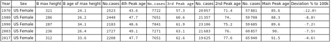
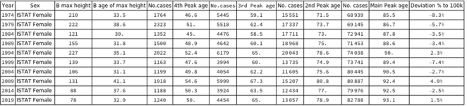
A recurrence of the shape (self similarity-like) of the new peaks found can be seen in the above Figures, which show a persistent asimmetry to the left. Also noticeable is the reduction in heights and consequently in the areas subtended by the curves (note the change in scale of the y-axis for the various Figures). Finally, recursion stops when the new curve obtained by difference from the previous one no longer shows evidence of peaks to be mapped with mTC or reaches an age range near to the B zone. This is the case in Figure 10 where after the last graphical subtraction, only an almost flat area appears. This flat zone can be assimilated to the aforementioned zone B of the demographic tables. This recurring exercise was applied to all of the population cases considered in Appendix I (Figures A1, A2 and A3). The outcomes led to the significant result that in all of the situations considered, no more than four mTC curves can cover the zone C of the population curves. For all the cases indeed, after the fourth iteration the resulting graphical curve appears semi-flat and/or distributed over an age range corresponding to the age range of zone B. Accordingly, we can consider the above Fredholm's equations solved with four mTC functions each characterized by a specific i-th TC (and consequently an ap) and an i-th weight f (or w). These results are summarized in Figures 11, 12 and 13 for the case of females in the USA, Italy and Japan.
These data show in the third column the maximum height level of the last iteration in zone B, while the fourth column indicates the age of maximum height in zone B itself. The subsequent columns indicate the area (No. cases) of the single-component mTC curve and the relevant peak age in years (‘ap’ parameter). The ‘ap’ parameter is used in the data to allow an immediate view of the position of the mTC peak. These data can also be used to reconstruct the dx function using eq. (3) as follows in the next section. Finally, the last column defines an accuracy value in the calculations measured as the percentage fraction between the sum of the areas of the four mTC functions compared to the total number of cases of 100000. This sum should theoretically always be less than 100000 since it does not include data areas A and B and the right lobe of the difference curves but only considers the reconstruction of area C with the four identified mTC functions. To these theoretical errors, it must be added the possible inaccuracies related to interpolations and peak searches. The data also show the growth in longevity over the years and from country to country.
4. Reconstructing the dx Curve with the Solutions Found
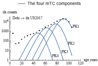
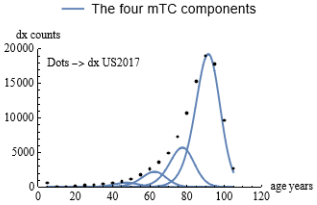
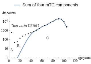
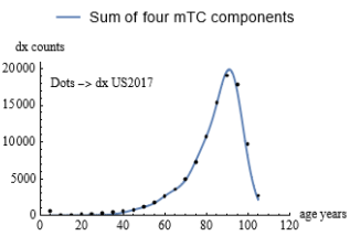
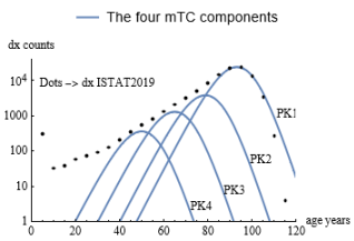
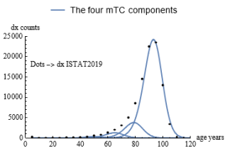
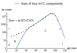
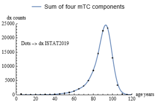
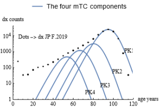
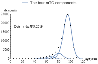
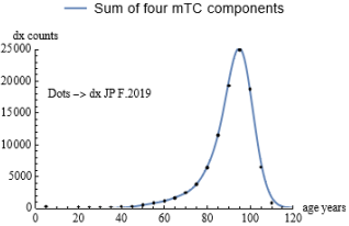
From the graphs and data shown above for the three cases study, we can verify the correctness of the solutions found. To this task we use eq. (3) where w(t0) corresponds to the individual areas (No. cases) in Figures 11, 12, 13 and mTCnp(a,ap) will be given by a relevant formula in the Appendix II with the parameter ‘ap’ taken from the above data Figures. Then we can numerically calculate the second member of eq. (3) and compare the result with the actual demographic data dx. The plots of the results are given hereunder for e.g. US 2017 with log scale and linear scales. In the first two figures we give the individual plots of the four components that build up the mortality data. In the next two figures the sum of the components is given compared with dots corresponding to the demographic table sampling. The A, B and C zones are also addressed.
A similar exercise was carried out for the Italy 2019 and Japan 2019 data as shown in the following figures. The fourth (small) peak curve is almost invisible in the linear plot due to the low cases count. From the above examples, it can be seen that the reconstruction of the actual mortality data by means of the four mTC functions identified as solutions of the Fredholm equation is quite accurate in the age range from 40 years to 105 years, i.e. in most of zone C of interest. Zones A (infant mortality) and B (flat mortality probability) are highlighted and are as expected outside our study data interval. Similar figures are obtained for all the other cases from different years of mortality sampling and in the different considered countries.
Figure 25. Plot of subsets sum for fem. Japan 2019 (linear scale).
From the above examples, it can be seen that the reconstruction of the actual mortality data by means of the four mTC functions identified as solutions of the Fredholm equation is quite accurate in the age range from 40 years to 105 years, i.e. in most of zone C of interest. Zones A (infant mortality) and B (flat mortality probability) are highlighted and are, as expected, outside our study data interval. Similar figures are obtained for all the other cases from different years of mortality sampling and in the different countries considered.
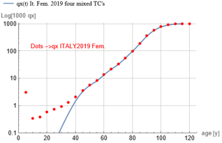
5. Reconstructing the qx Curve with the Solutions Found
In the Life Tables, in addition to the dx data, also the qx data are present. These data represent the ratio between the deaths -in a given age period- and the number of survived subjects entering at the beginning of this period. These qx's data depict therefore the probability to die in the age period considered. In Ref.
[2]
G. Alberti "Fermistatisticsmethodappliedtomodelmacroscopicdemographicdata”
the author derived an explicit continuous time (age) function form for the qx data based on the mTC continuous function model. We recall here this form as defined:
where N(t,TC) is given by:
;gg=0.5;
We see from above that, given the mTC function, also the qx(t) function can be derived by integration of the mTC.
This integration is indeed possible and therefore an analytic expression of the N(t,TC) is made available in Appendix II. Now, coming back to the four mTC components that build-up the most part of the dx profile of the various demographic data presented in Section 4., one can wonder if these components -when mixed in the same proportions and TC's parameters considered for the dx study- can lead also to a reconstruction of the correlated mixed qx datum. We consider then the equation:
where a is the age of the population and ρi=wi/TCi. The wi and the TCi parameters are the same used in eq. (3) and Section 4 for the reconstruction of the dx data. The Figure 26 shows the result of this exercise for the case of Italian females in year 2019 when compared with qx's Life Table data. A good fitting is obtained for ages over about 40 years.
Figure 26. Plot of 1000 qxmix for Italy females 2019.
6. Discussion of the Results
Two main aspects emerge from the data collected:
- Similarity
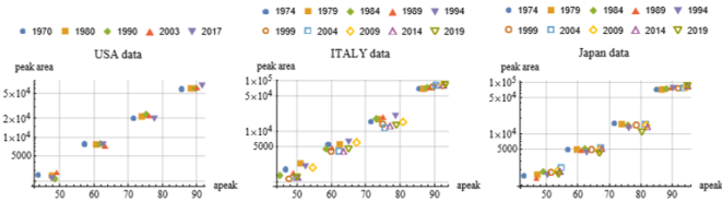
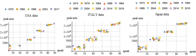
Data in Figures 11, 12 and 13 show that the four peaks are almost equally spaced (between 11-15 years interval) for almost all cases/countries considered. This is also shown in Figure 27. These graphs plot the areas (weight) of the component’s vs the ap parameter. It is seen that four clusters of points identify the four components of mortality. This feature - common for the US, Italy and Japan - leads to a similarity in peaks shape for the three countries.
Figure 27. Plot of peaks areas vs peak ages & fem. Demographic Table year for the three countries.
In the Log-scale graphs of Figure 27, we see a steady shift of the positions of the component peaks age to the right from old to more recent years of demographic sampling, a fact consistent with an improvement in lifespan.
- Invariant structure
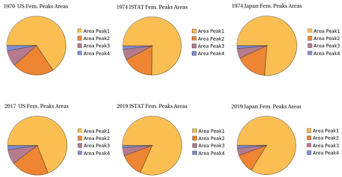
The following pie charts show the relative share of mortality cases (areas of the mTC peak's curves) between the components for initial years of sampling and final years of sampling. We see that the four components pattern is permanent in the two extreme dates of the demographic sample years. The four components structure is always present also for the other sample years (omitted for brevity). The shrinking trend of the other components vs the main peak is also evident from old sample year to recent sample year.
Figure 28. Share of mortality components for initial/final years of sampling and countries.
7. The Male Data
Up to this point, all the data considered concern the case of the female sex. A similar exercise was carried out for the male case (Figure 29). In this case, the data show a certain greater statistical dispersion (e.g. peak’s FWHM), which leads to a relatively greater inaccuracy in the reconstruction of the Fredholm equation. Despite this, however, the results for males also confirm the invariances found for females, i.e. the presence of four main components similarly spaced by age and with a similar structure of relative weights. This is true for the three countries considered and for all sampling years. In order not to burden the reader, the graphs and data for the male case are omitted here with exception of the following Figure 29. These graphs also reveal the well-known difference in longevity between males and females, the various male data clusters being all on average backward in age compared to the female clusters seen in Figure 27.
Figure 29. Plot of peaks areas vs peak ages & male dem. Table year for the three countries.
8. Summary and Conclusions
A number of facts emerge from the results outlined above:
- the large part of zone C (that of maximum mortality vs. age) can be represented by the linear combination of four main components that can be described analytically by mTC functions. This holds for both dx and qx Life Tables data.
- this feature is true for all countries and for all sampling years taken into account, so it appears to be an invariant characteristic of demographic mortality for these instances
- the four aforementioned components appear on average equally spaced in the age peaks (for females ~50, ~63, ~77, ~90 ages) and are always present for all sample years and in all three countries
- the three minor components decrease as a share of the total with increasing sample years and lifespan, which is consistent with Ref.
[1]
G. Alberti “Aconjectureondemographicmortalityathighages.”
conjecture that demographic mortality at older ages will converge to a single mTC function (the big Peak 1) as lifespan increases.
At this point, our findings on the components of demographic mortality should be compared with the discussion in the literature on whether there are subcomponents of mortality in the aging process. Some studies highlight a non-linear growth in aging and the possible presence of population subgroups (Ref.
[9]
Jacques Demongeot, Pierre Magal, ‘Populationdynamicsmodelforaging‘,
J. D. Zazueta-Borboa, J. M. Aburto, I. Permanyer, V. Zarulli & F. Janssen, ‘ContributionsofagegroupsandcausesofdeathtothesexgapinlifespanvariationinEurope’,
P. Y. Nielsen, M. K Jensen, N. Mitarai, S. Bhatt, ‘ASystemsLevelExplanationforGompertzianMortalityPatternsisprovidedbythe"MultipleandInter-dependentComponentCauseModel”’,
In particular, a correlation with a recent study using a multi-omics approach must be highlighted: in a paper published in August 2024 in the journal Nature Aging (Ref.
[19]
X. Shen, C. Wang, X. Zhou, W.Zhou, D. Hornburg, S. Wu & M. P. Snyder “Nonlineardynamicsofmulti-omicsprofilesduringhumanaging”, Nature Aging,
), researchers highlighted a non-linear disease risk that accumulates with the biological ageing process. "The analysis revealed consistent nonlinear patterns in molecular markers of aging, with substantial dysregulation occurring at two major periods occurring at approximately 44 years and 60 years of chronological age" (cit. from Ref.
[19]
X. Shen, C. Wang, X. Zhou, W.Zhou, D. Hornburg, S. Wu & M. P. Snyder “Nonlineardynamicsofmulti-omicsprofilesduringhumanaging”, Nature Aging,
). This study involved a sample of US persons aged 75 years and under. In our present study, we showed the possible existence of discrete components of demographic mortality with age clusters. These two approaches - conducted in completely different ways - show a correlation of results.
In conclusion, the issue of mortality in old age, i.e., the issue of aging, is subject to multiple hypotheses about its possible causes. Our study proposes the following conclusions: there are six overall components of demographic mortality, namely: infant mortality, the flat area in middle age and four components in higher ages, the latter being almost equidistant in age intervals and distributed with exponential relative weights and described by mTC functions. These six components change in their relative weights as lifespan changes. In particular, as lifespan increases, all components except the main one decrease but do not disappear altogether. In the long run, it can be foreseen that the main mortality peak will converge towards a single prevailing mTC function.
Abbreviations
FWHM
Full Width at Half Maximum
TC
Total Cases
Author Contributions
Giuseppe Alberti it is the sole author. The author read and approved the final manuscript.
Funding
This work is not supported by any external funding.
Data Availability Statement
The data supporting the outcome of this research work has been referred in this manuscript.
Conflicts of Interest
The author declares no conflicts of interest.
Appendix
Appendix I: Mortality Data
The following numerical data are derived from Ref.
[5]
L. A. Gavrilov and N. S. Gavrilova, “MortalityMeasurementatAdvancedAges:aStudyoftheSocialSecurityAdministrationDeathMasterFile”, North American Actuarial Journal. 15(3): 432-447.
) is equal to five and the demographic Life Tables dx and qx data are given at 5 years intervals. Then we have:
-The general mTC function of the variable a (age) and a parameter TC (referring to Total Cases) proportional to the area underlying the function curve:
- The normalized function mTCn(a,TC) where the area under the curve is constant and independent from TC:
- The normalized mTCnp(a,ap) function with parameter ap equal to the year at which peak of the function is reached:
- Some mTC additional features are:
- The relations between apeak and TC:
;
;
-The curve max height value (peak value) with vs TC parameter:
-The N(a,TC) explicit function to be used for the continuous calculation of qxmix:
References
[1]
G. Alberti “Aconjectureondemographicmortalityathighages.”
S. Twomey “OnthenumericalsolutionofFredholmintegralequationsofthefirstkindbytheinversionofthelinearsystemproducedbyquadrature.” J. ACM 10 (1963), 79-101.
[4]
Fredholm Integral Equations, web site: Available from:
L. A. Gavrilov and N. S. Gavrilova, “MortalityMeasurementatAdvancedAges:aStudyoftheSocialSecurityAdministrationDeathMasterFile”, North American Actuarial Journal. 15(3): 432-447.
J. D. Zazueta-Borboa, J. M. Aburto, I. Permanyer, V. Zarulli & F. Janssen, ‘ContributionsofagegroupsandcausesofdeathtothesexgapinlifespanvariationinEurope’,
P. Y. Nielsen, M. K Jensen, N. Mitarai, S. Bhatt, ‘ASystemsLevelExplanationforGompertzianMortalityPatternsisprovidedbythe"MultipleandInter-dependentComponentCauseModel”’,
Alberti, G. (2026). More on the Mortality Conjecture: The Components of Demographic Mortality. Humanities and Social Sciences, 14(1), 20-31. https://doi.org/10.11648/j.hss.20261401.13
Alberti, G. More on the Mortality Conjecture: The Components of Demographic Mortality. Humanit. Soc. Sci.2026, 14(1), 20-31. doi: 10.11648/j.hss.20261401.13
Alberti G. More on the Mortality Conjecture: The Components of Demographic Mortality. Humanit Soc Sci. 2026;14(1):20-31. doi: 10.11648/j.hss.20261401.13
@article{10.11648/j.hss.20261401.13,
  author = {Giuseppe Alberti},
  title = {More on the Mortality Conjecture: The Components of Demographic Mortality},
  journal = {Humanities and Social Sciences},
  volume = {14},
  number = {1},
  pages = {20-31},
  doi = {10.11648/j.hss.20261401.13},
  url = {https://doi.org/10.11648/j.hss.20261401.13},
  eprint = {https://article.sciencepublishinggroup.com/pdf/10.11648.j.hss.20261401.13},
  abstract = {In a previous preprint article, the author presented a conjecture on the trend of demographic mortality as the life span progresses. That article also provided a mathematical formulation of the statistical distribution to which mortality would tend in this case. In the present work, we show the possibility that the demographic mortality at high ages would be given by the sum of four main components. The four components were derived by iteratively solving the Fredholm equation that can be associated with the model. These solutions are presented for three demographic cases based on statistical data available in the public databases and literature. These are: mortality data in the US from 1970 to 2017, in Italy from 1974 to 2019 and in Japan from 1974 to 2019. In all cases, similarities and invariant components are noted and presented in graphs and numerical data. The four aforementioned components appear on average equally spaced in the age peaks (in the case of females ~50, ~63, ~77, ~90 ages) and are always present for all sample years and in all three countries. These same components can be used to reconstruct the qx datum, at advanced ages, of the considered Life Tables. A correlation with a more recent study using a multi-omics approach is pointed out.},
 year = {2026}
}
TY  - JOUR
T1  - More on the Mortality Conjecture: The Components of Demographic Mortality
AU  - Giuseppe Alberti
Y1  - 2026/01/09
PY  - 2026
N1  - https://doi.org/10.11648/j.hss.20261401.13
DO  - 10.11648/j.hss.20261401.13
T2  - Humanities and Social Sciences
JF  - Humanities and Social Sciences
JO  - Humanities and Social Sciences
SP  - 20
EP  - 31
PB  - Science Publishing Group
SN  - 2330-8184
UR  - https://doi.org/10.11648/j.hss.20261401.13
AB  - In a previous preprint article, the author presented a conjecture on the trend of demographic mortality as the life span progresses. That article also provided a mathematical formulation of the statistical distribution to which mortality would tend in this case. In the present work, we show the possibility that the demographic mortality at high ages would be given by the sum of four main components. The four components were derived by iteratively solving the Fredholm equation that can be associated with the model. These solutions are presented for three demographic cases based on statistical data available in the public databases and literature. These are: mortality data in the US from 1970 to 2017, in Italy from 1974 to 2019 and in Japan from 1974 to 2019. In all cases, similarities and invariant components are noted and presented in graphs and numerical data. The four aforementioned components appear on average equally spaced in the age peaks (in the case of females ~50, ~63, ~77, ~90 ages) and are always present for all sample years and in all three countries. These same components can be used to reconstruct the qx datum, at advanced ages, of the considered Life Tables. A correlation with a more recent study using a multi-omics approach is pointed out.
VL  - 14
IS  - 1
ER  -